Drarry on AO3: Freeform tag associations to fic ratings
I’ve been working on some dialogue-related analyses for Detroit: Become Human. While looking around for how I could proceed with a roadblock, I came across correspondence analysis (CA). It seems like it’s been used a fair bit in the computational humanities (e.g., being used to study the style of Dickens’ writing), so I’ve quite a bit of hope that it’ll help.
Correspondence analysis is similar to PCA, but applies to categorical data instead of continuous data. It works on contingency tables and can help in the exploration of relationships between two sets of variables. In this case, I’m looking at the association between (1) freeform tags and (2) the fic’s rating in Drarry fics.
This was sort of a practice run using CA, because it’s easier to intuitively tell if the results were ok/the analysis ran right. Credit for the analysis flow goes to this wonderful article. If you’re here from my Tumblr looking for the interactive image from the gif post, here it is. There’s more to CA than that final plot though, and I’ll be covering what I’ve learned so far in full below.
Content
1) Preparation and initial results
2) Default symmetric biplot
3) Quality of representation and contribution to dimensions
4) Final asymmetric biplot
5) Conclusion
Preparation and initial results
Preparation
I start by selecting any fics with Drarry tagged as a relationship in them. The freeform tags were standardized (with help from the look-up available with the AO3 data dump) and I kept only the top 2000 freeform tags for analysis. I then counted the number of times each of the tags was used per rating category. In the final dataframe, the ratings were represented as 5 rows (explicit, mature, etc.) and the freeform tags as columns.
Initial results
Running a Pearson’s chi-squared test returns a significant result, showing that there is a significant association between the freeform tags and fic ratings. Great!
Running CA returns the following scree plot.
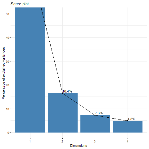
We can see that the first two dimensions already explain 87% of the variance in the data. So, we can proceed to just use these two dimensions for visualization. At the same time, the eigenvalues for both dimensions are quite low (versus a maximum of 1). The first dimension has an eigenvalue of .27 and the second has an eigenvalue of .06. That means (if I’m not wrong) that many freeform tags are not exclusive to certain ratings. E.g., many tags you may see in teen-rated fics may also appear in mature-rated fics, instead of having a strong association with just one rating like teen.
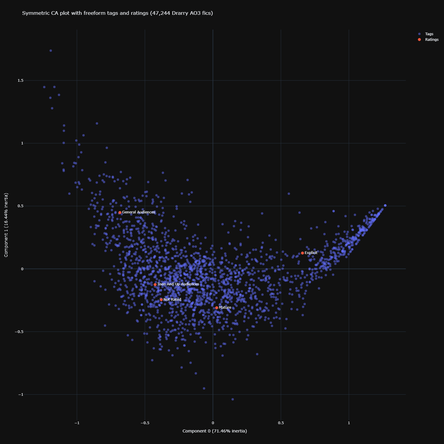
Default symmetric biplot
Click here for the interactive version
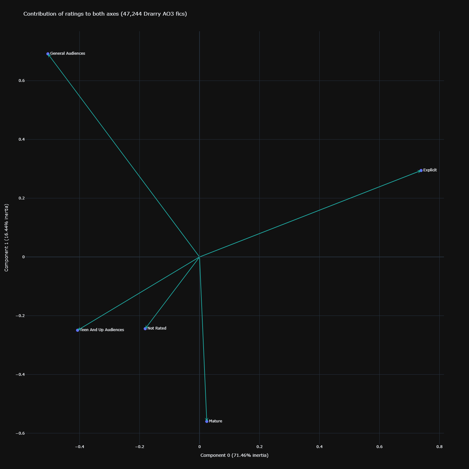
The default plot produced from CA is a symmetric biplot. To start us off, we notice first that the first dimension (x-axis, Component 0) has 71.46% inertia, or variance explained. The second dimension (y-axis, Component 1) has 16.44% inertia. What this means is that the bulk of the variance is explained by the first dimension, and much less so by the second dimension.
Next, with this plot, we can also interpret the distance between different row points (ratings), and distance between different column points (freeform tags). Freeform tags which appear closer to each other in the graph are thus more similar to each other, same with ratings which appear closer to each other.
Unfortunately, we cannot directly interpret the distance between row and column points beyond general observations. For that, we will have to look at the asymmetric biplot (shown later).
From the symmetric biplot we can see that teen-rated and not-rated fics are closer in profile than with the other ratings. There is an obvious clear separation between explicit and general audience-rated fics (different poles of the x-axis, or Component 0 – the first dimension). We also observe that mature and explicit-rated fics are not that similar (different poles of the y-axis, or Component 1/the second dimension, though less extreme than general vs explicit on the first dimension).
This observation about the mature vs explicit difference echoes what I found in my earlier work on Detroit: Become Human, with unigrams and with STM. In those analyses, I found that mature-rated fics were distinctive from explicit fics by focusing far less on smut, and more on violence/crime-related topics. Hovering around the freeform tags on the plot show a rather similar pattern in Drarry. Freeform tags clustering near Explicit are tags like ‘Omega Draco Malfoy’, ‘Submission’, and ‘Fetish’. Freeform tags clustering around Mature are tags like ‘War’, ‘References to Drugs’, and ‘Verbal Abuse’. Again, these are general observations and we cannot tell for sure from the symmetric biplot the strength of these associations between the freeform tags and the specific ratings.
Besides this, we also note that certain freeform tags just kind of hang around the origin (0,0). These are tags like ‘Post-Harry Potter and the Deathly Hallows’, ‘Auror Harry Potter’, and ‘Potioneer Draco Malfoy’. What this means is that these tags are probably not really distinctive, at least on the two dimensions we’ve visualised. They’re kind of average-ish and not very unique.
Quality of representation and contribution to dimensions
Before we move on to the final asymmetric biplot, we should take a look at the quality of representation of the different ratings and the freeform tags on these two dimensions. Certain ratings and/or certain freeform tags may not be as well-represented on these two selected dimensions versus others. We represent quality of representation by using the squared cosine value (cos2, ranges from 0 to 1). Lower cos2 values mean poorer quality of representation.
Quality of representation of different ratings
From calculating cos2, I found that the representation of teen, explicit, and general audience fics was pretty good on the x-axis/first dimension. The cos2 values were .76, .96, and .68 respectively. This makes sense because if you go back to the symmetric biplot above, you can see that these three ratings are pretty far from the x=0 point of the graph (remember, closer to origin = less distinct). The mature rating was very close to the x=0 point of the graph. This poor representation on the first dimension was captured in its cos2 value of .005 (!).
On the other hand, we see the mature rating is much better represented on the second dimension (it had a cos2 value of .61 on it). Again, this is reflected in the symmetric biplot above, where you will be able to see that while mature is close to x=0, it is not at all close to y=0.
This leaves us with the not-rated rating, which has a fairly weak representation on both dimensions (.27 on the first, and .11 on the second). This is also captured in the symmetric biplot – it’s not as far as the teen rating on the x-axis (thus the lower cos2 value), but is slightly higher up on the y-axis (thus the slightly higher cos2 value; the teen rating had a cos2 value of .07 on the second dimension). The best representation of the not-rated rating was on the un-visualised third dimension, with a cos2 value of .42. I really like (nice) 3d-visualisations, but haven’t been able to make a good looking one. I might revisit this with a 3d plot in future when I get better.
The following plot shows the quality of representation for all ratings combined across both dimensions.
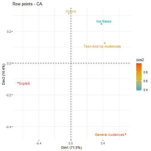
We see that explicit and general audience ratings receive the best representation, followed by teen, mature, and lastly not-rated.
Quality of representation of different freeform tags
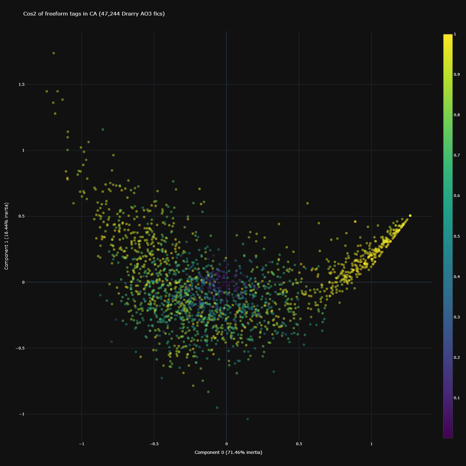
Since there are 2000 freeform tags, I was unable (read: unwilling/lazy) to sift through them one-by-one to check their cos2 values on each dimension. Instead, I’ve visualized the quality of representation on both dimensions for all freeform tags in the image below.
Click here for the interactive version
We see that the tags which are likely from explicit fics (on the far right) have very good representation on both dimensions. Notice that those in the middle are very poorly represented by these two dimensions.
Contribution to dimensions (and what do the dimensions mean exactly?)
So, I’ve mentioned dimensions an excruciatingly large number of times in a kind of abstract sense. What do they mean exactly in a qualitative sense?
Perhaps by now you’ve come to the sense that the first dimension is obviously about the smut vs fluff, or explicit vs general audience fic divide (which also explains why its inertia is so high) – and I’d agree with you, on the basis of the placement of the explicit/general ratings in the plot, and the freeform tags that are hanging around those poles.
I honestly found the second dimension a little harder to interpret. It’s clearly defined by the mental health issues/abuse topics covered in mature fics, but what would be the opposing pole? Based on the symmetric biplot, it doesn’t seem that there are many freeform tags hanging around the opposite pole of those tags either.
We could turn to a row (rating) contribution plot to help the interpretation a little. In this plot, I’ve removed all the freeform tags for clarity.
Click here for the interactive version
Here we look at the angular distance between the rating and the x-(first dimension) and y-axes (second dimension). The closer the arrow is in terms of angular distance (more acute angle) to the axis, the greater contribution of that rating to the dimension of that axis. If the angle is kind of equidistant between both x- and y-axes, the rating contributed equally to both dimensions.
We thus see that teen, general, and explicit contributed quite equally to both dimensions. The mature rating contributed largely only to the second dimension – it is far closer in angular distance to the y-axis than x-axis. So perhaps the second dimension really involves just those certain darker themes that are more distinctive of mature fics?
Final asymmetric biplot
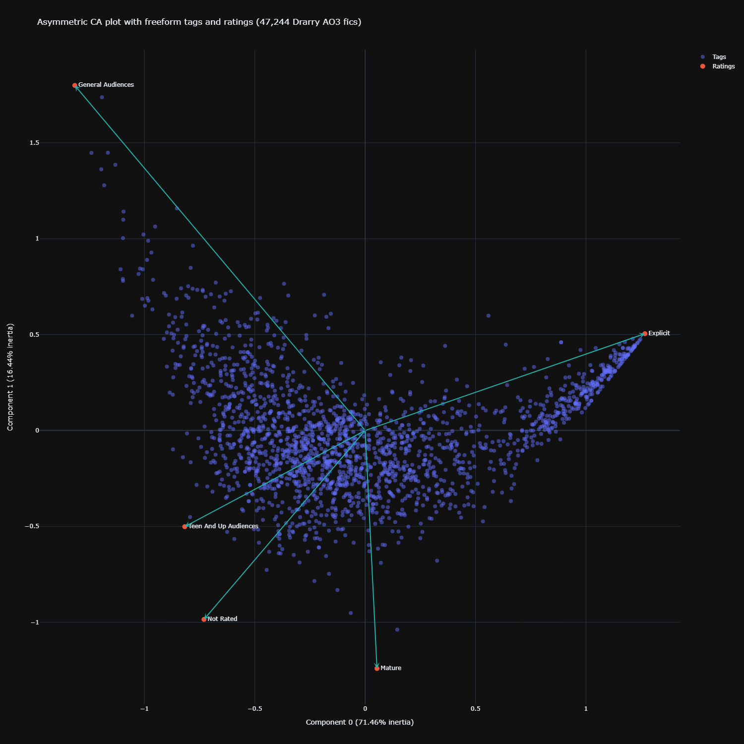
Now let’s look at the final plot – the asymmetric biplot. As mentioned earlier, the default symmetric biplot lets us make general observations about the patterns in the data, but we could not directly judge the strength of association between a freeform tag and a specific rating.
To create this asymmetric biplot, I chose the ‘colprincipal’ option, which represents the rows (ratings) in column (freeform tag) space. We can also do it the other way with ‘rowprincipal’, but from what I understand the final interpretation does not change.
Here is the asymmetric biplot:
Click here for the interactive version
At first glance it looks like nothing’s changed, but looking closely, we can see that the coordinates of the ratings have been adjusted slightly (they’ve all become more exaggerated). With this biplot, we can now judge the strength of association between a certain freeform tag and a certain rating. Imagine that each freeform tag also had an arrow pointing to it (I didn’t visualize these to keep it clean). If the arrow pointing to a certain freeform tag and a certain rating is acute, then there is a strong association between the tag and rating. For example, general audiences would be strongly associated with the tag ‘Inspired By Tumblr’, explicit with ‘Facials’, mature with ‘Past Torture’, and teen with ‘Hanahaki Disease’.
Conclusion
And that brings me to the end of my first foray with CA. This was a really fun and insightful analysis to run and I can see myself applying this to tons of stuff. I’m really looking forward to trying it out with the dialogue data I’ve extracted from the Detroit: Become Human dataset!